
Processing Financial Data Study
Read the published paperResearch overview
This was an independent research study I took on during my HCI minor in Spring 2020, and extended into the first half of that summer after my internship start date was pushed back. The goal was to understand how data scientists and auditors differ in the way they approach financial data validation:
Do the two groups favor different tools and strategies when looking for fraud or outliers in a dataset? Does professional expertise shape the quality of that validation work — and is there a measurable gap between how data scientists and accountants read the same data?
Study design
Rather than handing participants a raw dataset and asking them to find fraud in it, we pre-built the data visualizations in Tableau. Giving the raw data without guidance would have put the accounting students at a disadvantage, since data science students tend to be more comfortable manipulating and visualizing data on their own. We also expected that professional background would shape which visualization types people trusted most — for instance, that auditors might lean on tabular views while data scientists gravitated toward histograms and scatterplots.
Each participant worked through visualizations built from two real datasets — company expenses and company salaries/bonuses — plus a toy warm-up dataset to get comfortable logging insights in the Tableau interface. The underlying data came from Data Analytics for Auditing using ACL, 4th Edition, with additional columns and injected fraud to make outliers easier to identify and the visualizations more interesting to explore.
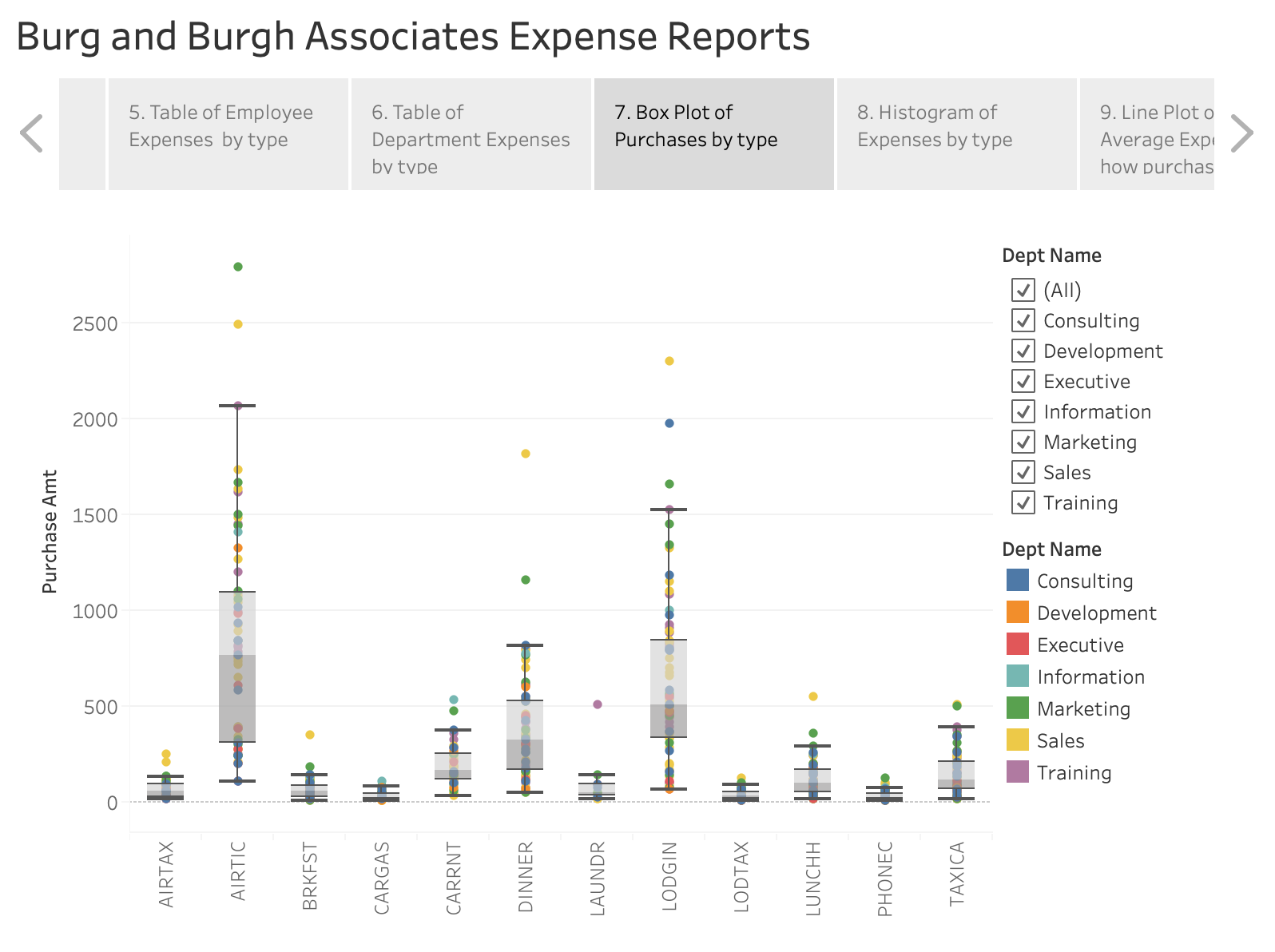
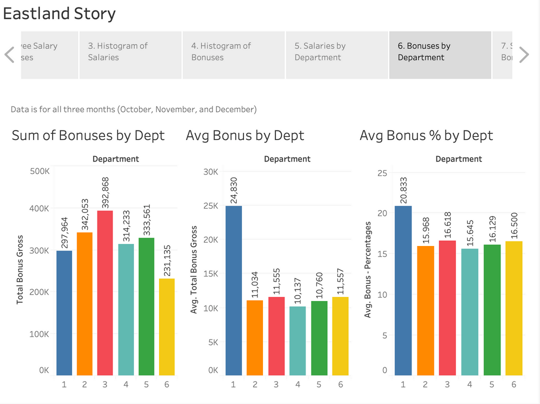
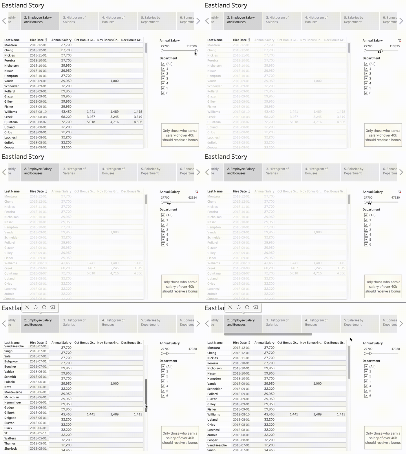
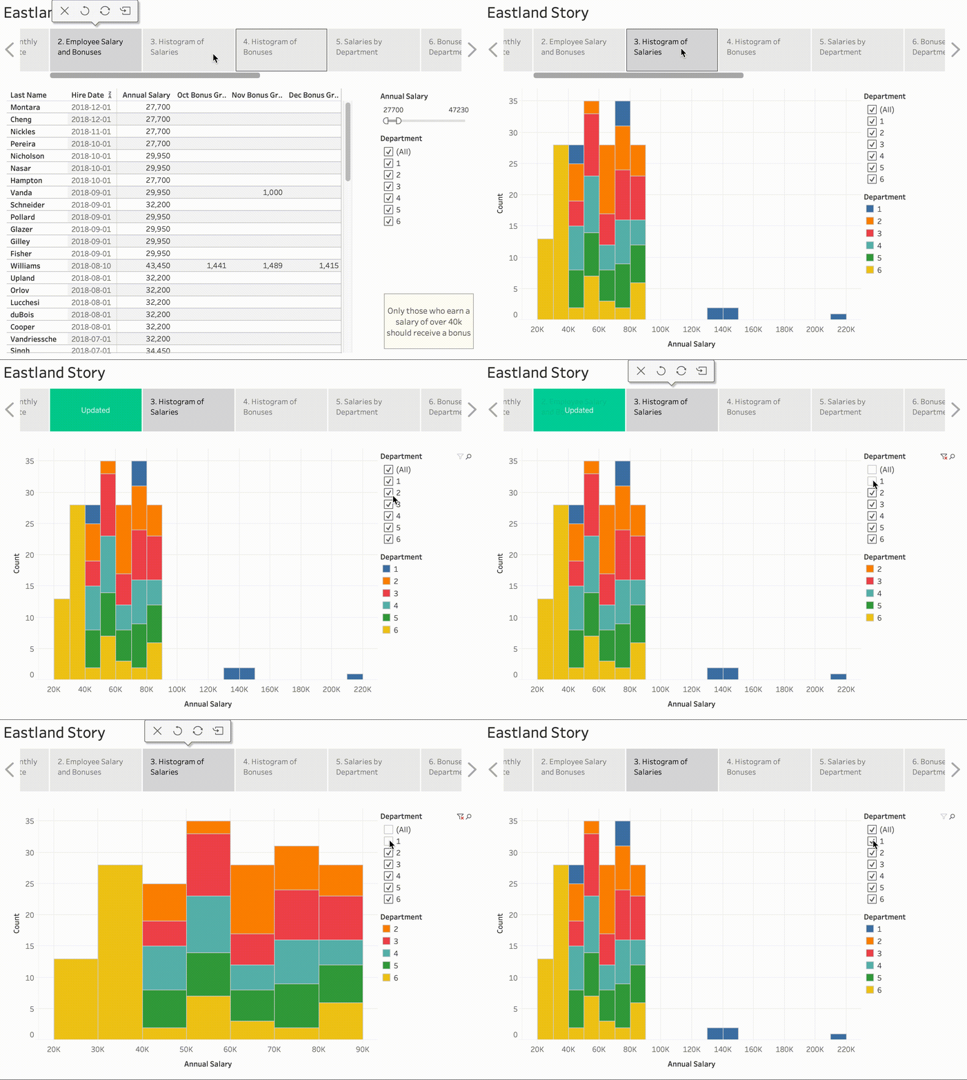
Each dataset had ten different visualizations within its Tableau story, mixing boxplots, bar graphs, line plots, and tables so we could see whether preference varied by role. Most were interactive — participants could sort, filter, and hover for more detail on any given point.
Running the study
We ran the experiment with 16 Master's students — 8 studying Data Science and 8 studying Accounting — observing how each group approached the same visualizations and where their strategies diverged. The full findings are written up in the published paper linked above.